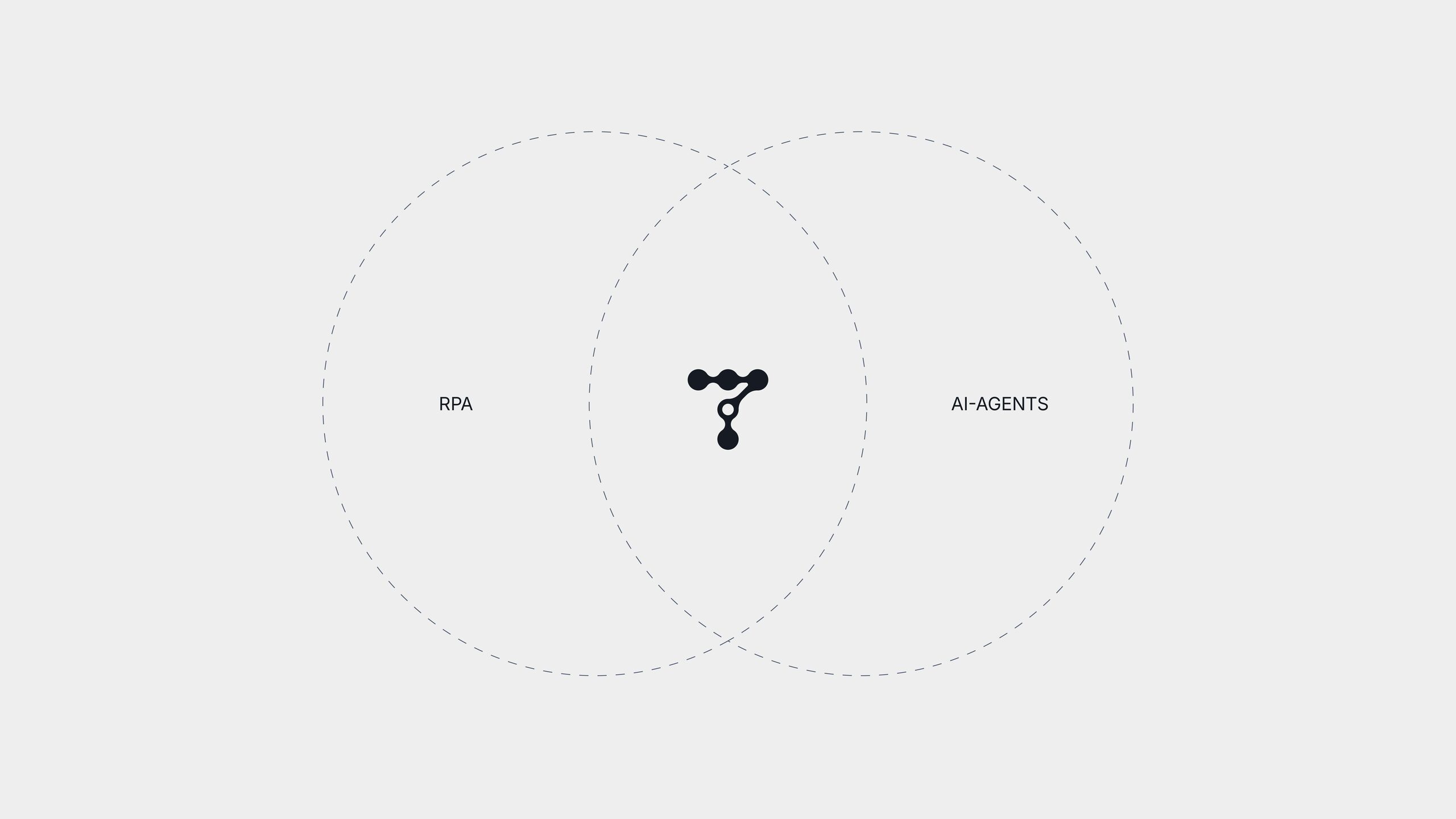
Telic is a workflow automation platform positioned between rigid automation bots and general AI agents, efficient where a process repeats and intelligent where it varies. That position existed only in words. The company was running on generic typography without a developed logo, so nothing in the visual identity carried the idea that set the product apart. Competitor research across the category showed a space split between corporate enterprise aesthetics on one side and generic AI visuals on the other, with no one owning the middle ground of controlled, selective intelligence.
Outcome
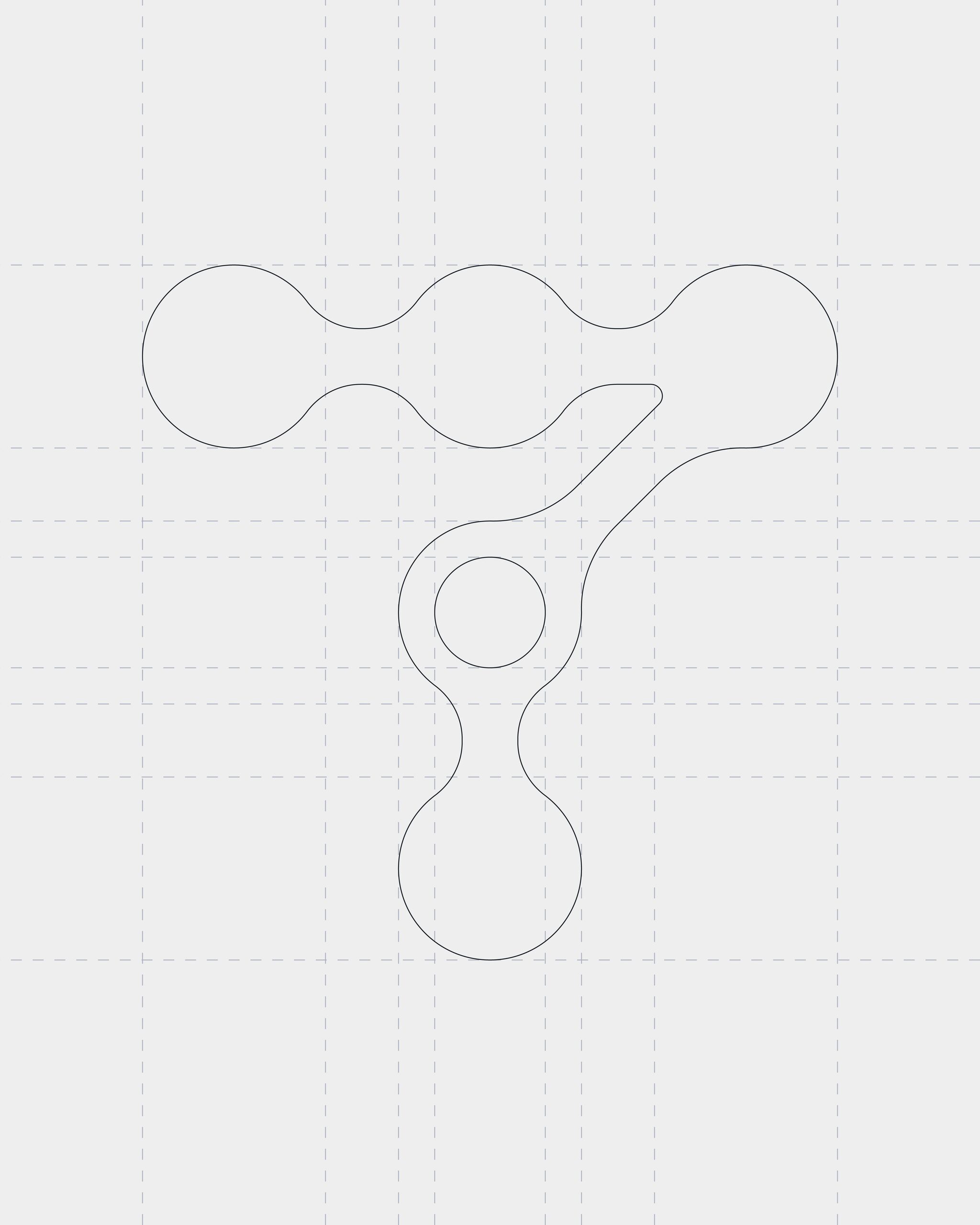
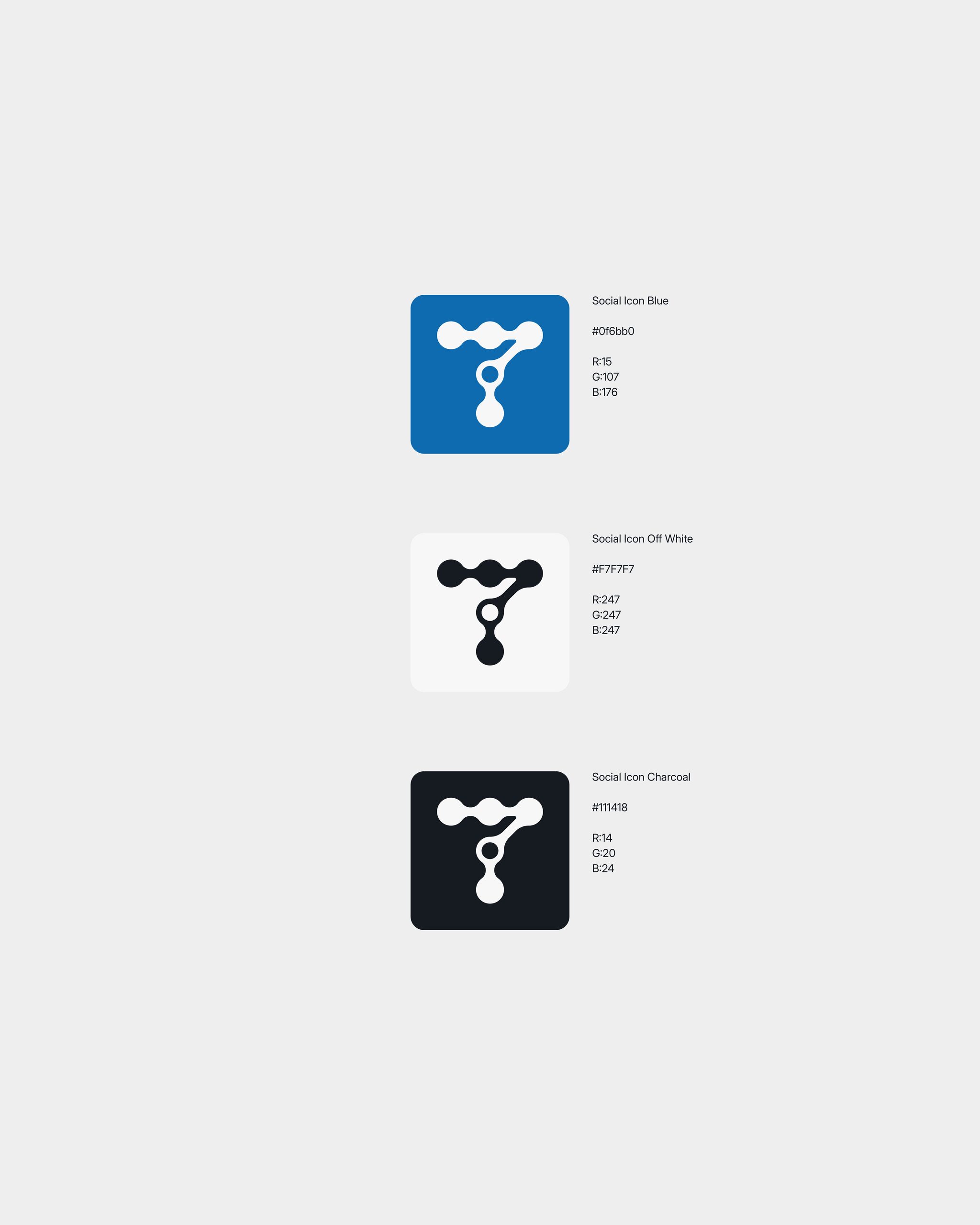
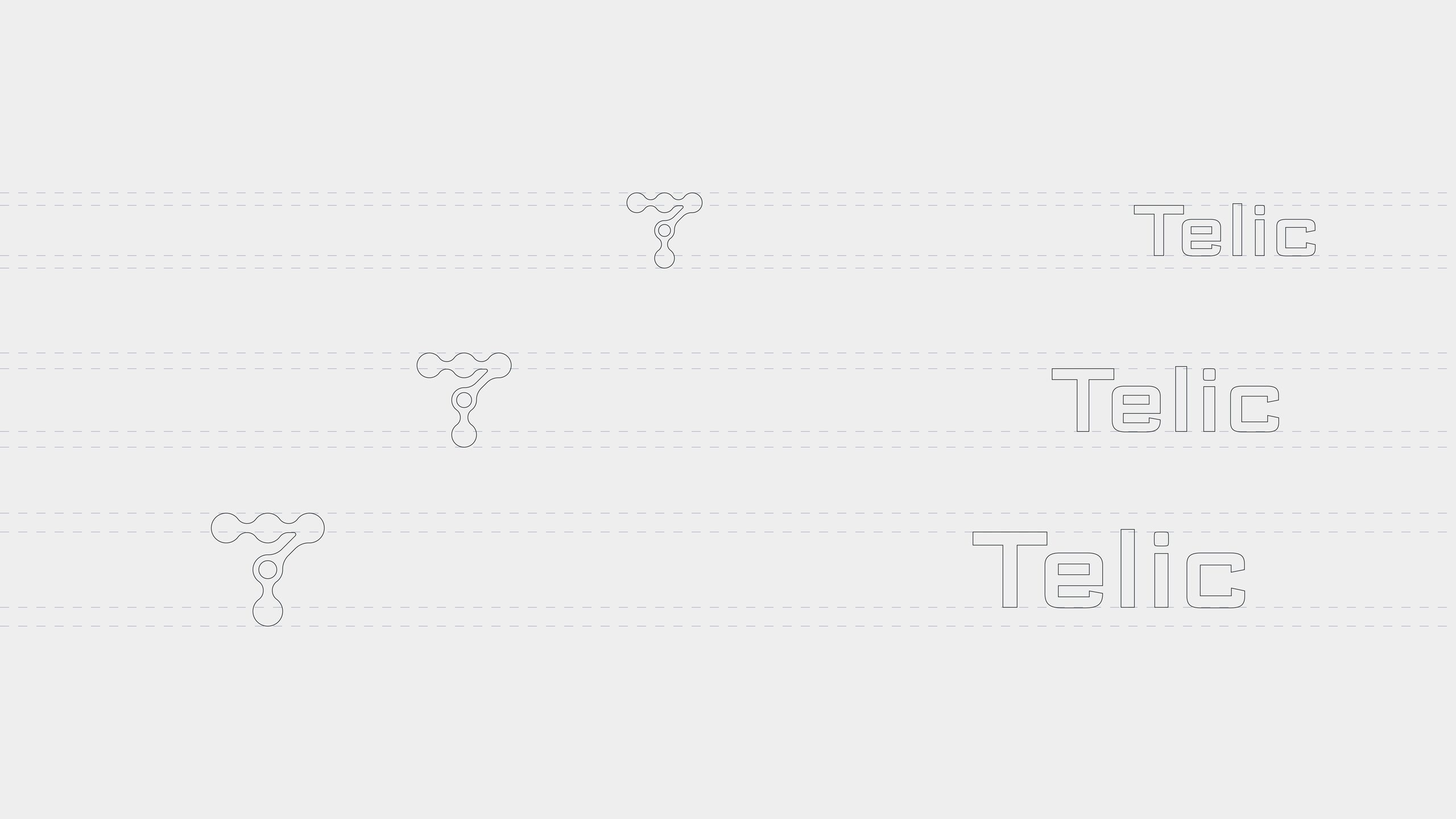
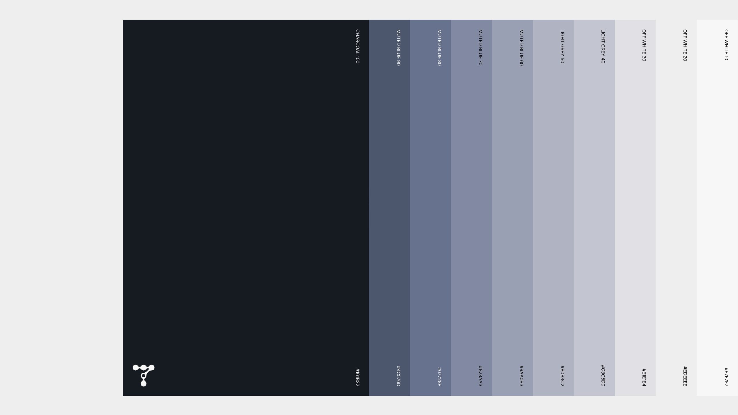
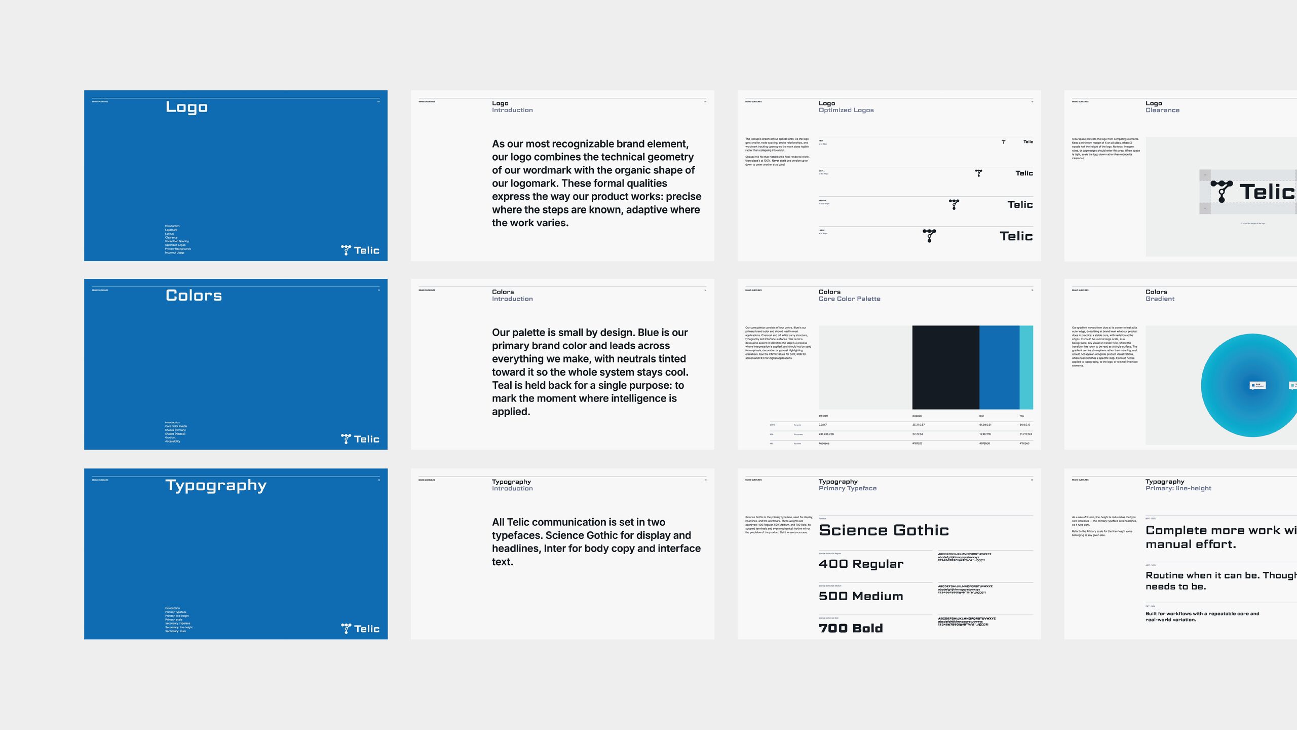
The logomark forms a T from connected nodes. Each node is a step in a process and each link a path between them, while a single open node marks the moment where intelligence is applied. That logic structures everything that follows. Blue is the primary brand color, and the neutrals are tinted toward it so the palette holds together as one family. Competitors in the category lean on warmer tones, while Telic speaks to a technical audience, so a cool and restrained palette separates the brand and suits the people it addresses. Teal is held back for one purpose only, identifying the step where interpretation happens. Science Gothic carries display, Inter carries body copy. The identity was delivered as full brand guidelines covering logo, color, typography and product visualization, together with a complete brand kit and logo animation.